ShopDreamUp AI ArtDreamUp
Deviation Actions


Description
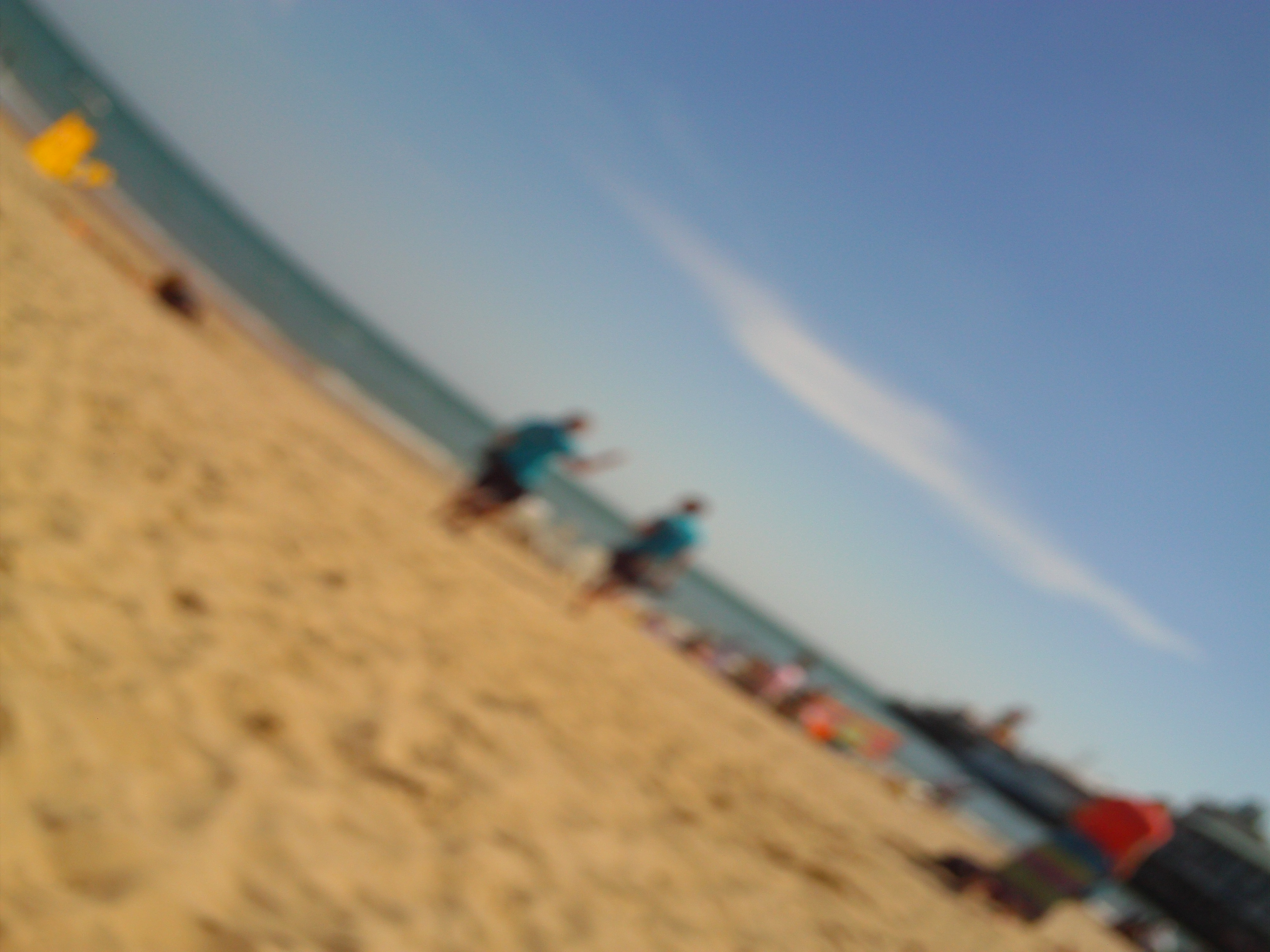
I know people may say this is poor macro but I really like it due to it all being kind of blurry and people are playing in the background!
Image size
4000x3000px 1.71 MB
Make
<
Model
<
Shutter Speed
1/1587 second
Aperture
F/492.3
Focal Length
0 mm
ISO Speed
50
Date Taken
Jan 7, 2008, 2:19:48 AM
Comments15
Join the community to add your comment. Already a deviant? Log In
So before I go into great detail on why I rated as i did I would like to share with you a funny little story. You should always read the description before reading the piece or in this case examine the artwork. I say this because I spent about five minutes staring at the picture as I waited for the quality to buffer. As I finished doing what I was doing on my phone I looked up to see this had still not buffered then stared at it for another minute before i scrolled down and found out that it was meant to be blurry. My fail.
Where to begin? Let's start with the most abundant. I say most abundant of course because I am generalizing an abundance of pictures of the beach. The category I am speaking of is Originality. It is hard for one to see a photo of something he sees every day both on the web and in real life and approach it as something marvelous. But I give you three and a half stars and I will return to this fact in a moment. First let me move on.
It took a great deal of consideration to rate this piece, and I promise you that I put a very large amount of thought into this photo. Upon first glance I saw a blurry photograph, which it actually is a blurry photograph. I want to say something intelligent sounding after this, but in all reality there isn't much to add other than that. Due to this I must grade your Technique at 3 stars. Please do not be offended by that as you are still at three, which is more than half of the maximum number of stars I could give you (the half being 2.5) this being said that means there are slightly more good points to it than bad. I urge you to not deny the fact that it is just a blurry photograph, but rather embrace it, as you seem to have done. The fact of the matter is you took a photo of a fairly enjoyable place at a fairly artistic camera angle. I want you to understand that the reason the rating isn't super high is not because it is blurred, but rather because it is not blurred very well.
I say that last point with a great deal of emphasis, and it is that very point that helps to explain your grade. You look at the rating and see one category that is awkwardly higher than the others. This is because I share the same attitude you displayed in your description. I like the scene too, and you had a great Vision. You found a great scene to display but you did not reach out for your full potential.
I said before that you did not blur the picture well. This is because you blurred it to absolutely no effect. If you had blurred it in some distinct way you probably would have pulled off something amazing. For example, I believe you should have had the bottom left corner of the photo to be crystal clear quality and then have the photo quickly blur as it gets farther away from that point. By the time it reached the two people in blue it could have been just as blurry, but you would have had a focus point and that would have been an amazing bit of perspective. I agree that a blur effect was a spectacular idea, but you should have used the blur in a more artistic way, and perhaps even done something with the color (of course that has nothing to do with the rating I am just suggesting a future idea which may not even be a very good one, but my statements on the blur stand firm).
I would have rated it much lower had I not actually took the time to look past what it appeared at first glance and consider every single aspect of the photo and situation. While you gained points on the impact, you could have had much more.
To recap everything:
Vision-4.5 great perspective
Originality-3.5 I live by a beach, what can I say
Technique- 3 be sure to have a purpose for your effects
Impact- 3.5 a well done piece, but try to work on the key points I mentioned
*if you like my critique please recommend me to others who are looking for detailed reviews*